You like coffee?

Me too.

Let's go for a cup. I'm always open to exchanging new ideas.

christinapoon518@gmail.com

Linkedin

© 2020 Christina Poon

You like coffee?

Me too.

Let's go for a cup. I'm always open to exchanging new ideas.

christinapoon518@gmail.com

Linkedin

© 2020 Christina Poon

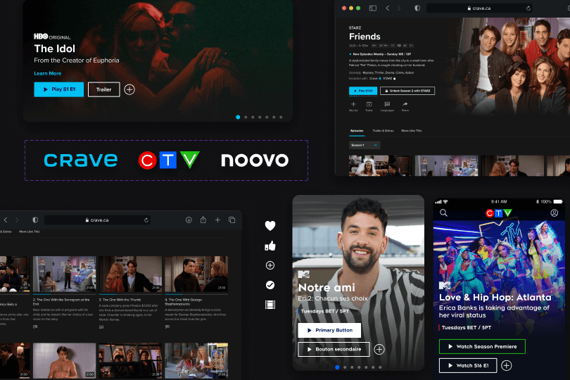
Now Live On iOS Android and Crave.Ca , CTV.ca, Noovo.ca

Sign In/Create Account Redesign

Creating a unified authentication experience.

Design System

UX/UI

Sign In/Create Account Redesign

Creating a unified authentication experience.

Design System

UX/UI

My Role

UX/UI Designer, Design Systems

My Team

Product Owner & Owners, Developers, UX Designer

Platform

Web & Mobile

Tools

Figma

My Role

UX/UI Designer, Design Systems

My Team

Product Owner & Owners, Developers, UX Designer

Platform

Web & Mobile

Tools

Figma

I led the redesign of Crave’s sign-in and account creation UI experience across web and mobile, creating a more consistent, scalable, and accessible authentication process. While my primary focus was UI design and design systems, I also collaborated closely with UX designers, product managers, and developers to ensure the experience addressed key usability issues, supported business goals, and was feasible for MVP implementation. The updated flows served as a foundation for future designs across Crave and other Bell Media platforms.

The Problem

Crave’s inconsistent authentication flow made it hard for users to understand what to do, leading to missed actions and drop-off.

To gain a better understanding of the problem, we conducted user tests on the current in-market flow and asked users to enter the platform through different touchpoints. This helped us identify the main pain points, which we then narrowed down to 4 key insights.

{image_31_2c66}
{image_32_7aa1}

In Market Experience

Unclear guidance across entry points

Users saw different sign-in or account creation screens depending on their entry point. With unclear labels and feedback it made it difficult to understand the next step.

Unclear guidance across entry points

Users saw different sign-in or account creation screens depending on their entry point. With unclear labels and feedback it made it difficult to understand the next step.

Poor hierarchy of primary actions

Essential CTAs were visually deprioritized, leading users to overlook or miss next steps.

Inconsistent and incorrect use of UI components

Elements like buttons, inputs, and error states deviated from the design system, resulting in a confusing user experience.

Agressive micro-interaction experiences

Users were met with errors while entering their information, creating unnecessary friction.

Design Goal

Create a scalable authentication flow that supports multiple entry points, reduces cognitive load, and meets accessibility standards

Flow clarity

Guide users through account creation or login with minimal friction.

Design System consistency

Redesign components using scalable, consistent UI patterns

Design System consistency

Redesign components using scalable, consistent UI patterns

Future-proof architecture

A reusable authentication flow that can scale with new features.

The solution

Introducing the new sign in/create account experience

A unified authentication flow that adapts to new and returning users without the friction.

{image_33_096a}

Not sure if you have an account?

Crave can detect if you’re an user and we’ll prompt you to put in your password

{image_33_096a}

We’ll guide you through signing up

if your email doesn’t exist, we’ll guide you step by step on creating an account

{image_33_096a}

Making it easy for Bell users to activate Crave

From SMS to sign-in, Bell customers were met with helpful prompts and UI that made activating their Crave plan feel effortless.

The solution

Introducing the new sign in/create account experience

A unified authentication flow that adapts to new and returning users without the friction.

{image_33_096a}

We’ll guide you through signing up

If your email doesn’t exist, we’ll guide you step by step on creating an account

{image_33_096a}

We’ll guide you through signing up

if your email doesn’t exist, we’ll guide you step by step on creating an account

{image_33_096a}

Making it easy for Bell users to activate Crave

From SMS to sign-in, Bell customers were met with helpful prompts and UI that made activating their Crave plan feel effortless.

Discover & Explore

Learning from the landscape

To better understand how Crave’s authentication flow compared, I explored patterns from both direct and indirect competitors. This helped surface best practices around guiding users through entry points with clearer language, flexible flows, and simplified decisions.

In Market Experience

Smarter start, smoother flow

After reviewing how competitors handled authentication, I noticed a shared pattern: a single entry point that adapts based on user context. I mapped out Crave’s existing flows and surfaced a similar opportunity. By introducing one flexible entry screen powered by system logic, we removed unnecessary choices and made the experience feel seamless.

Information hierarcy

Establishing hierarchy through a systemized structure

With a clearer understanding of the entry points, I then created a modular component that adapts across flows while maintaining a consistent visual structure.

Consolidating the variants

Once the modular system was defined, I revisited every screen in the sign-in and account creation journey. By replacing fragmented layouts with a unified component, we reduced visual noise, eliminated redundant patterns, and delivered a more cohesive experience.

Consolidating the variants

Once the modular system was defined, I revisited every screen in the sign-in and account creation journey. By replacing fragmented layouts with a unified component, we reduced visual noise, eliminated redundant patterns, and delivered a more cohesive experience.

Design System

Bringing brand and system together

Once the information architecture was set, we turned our attention to visual consistency. To move fast without sacrificing structure, we adopted the Radix open library which gave us a solid foundation to build branded components while streamlining development handoff.

New sign in / create account for all Bell Media Brands

Light Mode / Dark Mode

By creating tokenized styles and light/dark variants, I built components that flexed across themes. This sped up implementation and ensured visual consistency across all brands.

Light Mode / Dark Mode

By creating tokenized styles and light/dark variants, I built components that flexed across themes. This sped up implementation and ensured visual consistency across all brands.

From web to mobile

Using consistent tokens and layout rules, we ensured system components adapted across all platforms, reinforcing visual cohesion and reducing handoff friction.

From web to mobile

Using consistent tokens and layout rules, we ensured system components adapted across all platforms, reinforcing visual cohesion and reducing handoff friction.

Refining the details with microinteractions

Once the structure was in place, we then focused on mircointeractions - refining when and how users receive feedback. These subtle updates reduced unnecessary interruptions and supported better accessibility.

Textfield microinteractions

Before

Users were met with error messages while typing. Early validation often caused unnecessary friction and cognitive overload.

After

Error feedback now appears only after the user leaves the textfield, creating a smoother, less disruptive experience.

Textfield microinteractions

Before

Users were met with error messages while typing. Early validation often caused unnecessary friction and cognitive overload.

After

Error feedback now appears only after the user leaves the textfield, creating a smoother, less disruptive experience.

Password requirement microinteractions

Before

The in-market design surfaced all password rules at once, with high visual contrast that competed with the input field. This created noise and overwhelmed users before they even started typing.

After

The updated flow keeps the experience clean and focused. Password hints now appear only when needed, using softer contrast and subtle animation to support.

50%

Faster task completion time

50%

Faster task completion time

83%

Drop in user errors

83%

Drop in user errors

results

This project marked the beginning of a much larger shift.

We introduced shared components that brought consistency across different user journeys and entry points. This helped unify the experience across Bell Media platforms, connecting TSN, CTV, Noovo, and Crave under a more cohesive identity and laid the groundwork for bringing everything into one platform.

Takeaways

Cross-functional communication and collaboration

Working closely with developers, product managers, and designers helped surface technical constraints early and ensure solutions were grounded in what was feasible.This ongoing collaboration helped ensure designs were implemented as intended.

Documented, demoed, delivered

We built in time for working sessions and documentation to walk through interaction details, edge cases, and responsive behaviour. This gave developers the context they needed to bring the designs into production.